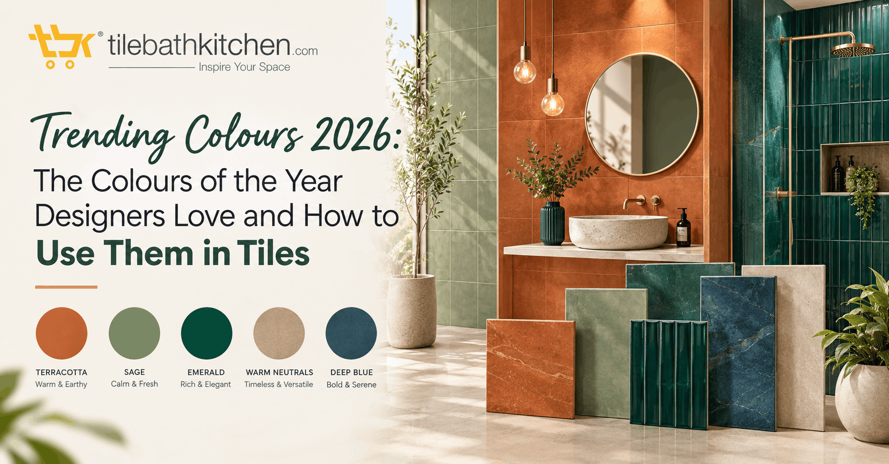
Every year, the big colour authorities and paint brands pick a Colour of the Year. Once it was only Pantone. Now almost every major brand names its own shade, and together they show where interior design is heading.
The 2026 picks tell a clear story. After years of bright, loud colour, designers are choosing calm whites, warm earthy neutrals, deep browns and soft nature-inspired greens. These are colours that feel restful and last, rather than trends that date in a year.
Here are the colours leading 2026, what they look like, and how to bring them into your home through tiles.
The 2026 Colours of the Year
Pantone: Cloud Dancer (11-4201). A soft, airy white. It was one of the most debated picks in years, because white rarely gets the title. Designers see it as a calm, clean base that lets materials and textures stand out.
Sherwin-Williams: Universal Khaki (SW 6150). A warm, mid-tone tan with earthy undertones and a slight yellow bias. It is a grounded neutral that works across almost any room.
Benjamin Moore: Silhouette (AF-655). A rich mix of espresso brown and charcoal, used as a softer, more sophisticated alternative to black.
Asian Paints: Moonlit Silk. India’s own pick, from the ColourNext forecast. A tranquil green with hints of yellow and white, chosen after research into how Indian homes are changing.
Other notable picks: Behr chose Hidden Gem, a blue-green. Valspar chose Warm Eucalyptus. Graham & Brown chose Divine Damson, a deep plum-like shade. Dunn-Edwards chose Midnight Garden, a deep muted green. Trend forecaster WGSN with Coloro picked Transformative Teal.
The Big Themes Behind the Colours
Look at the list together and three groups appear:
- Soft whites and warm neutrals such as Cloud Dancer and Universal Khaki, for calm, clean spaces.
- Deep browns and dark tones such as Silhouette and Divine Damson, for warmth and drama without harsh black.
- Nature-inspired greens and blue-greens such as Moonlit Silk, Warm Eucalyptus, Hidden Gem and Midnight Garden, for a sense of rest and connection to nature.
All three groups translate beautifully into tiles.
How to Use the 2026 Colours in Tiles
Cloud Dancer whites: the calm base. Use soft white or warm white tiles on bathroom walls and kitchen backsplashes. Pick a tile with gentle texture or a handmade-look glaze so the white feels warm rather than clinical. Pair with matching or tonal grout for a seamless look.
Universal Khaki: warm neutral floors. Beige, sand and tan tiles are the easiest way to bring this colour in. Stone-look, travertine-look and matte vitrified tiles in khaki tones suit living rooms, halls and bathrooms. They also hide dust and footmarks better than pure white.
Silhouette browns: the accent. Deep espresso and chocolate tiles work as a feature wall behind a vanity, a kitchen backsplash, or a powder room floor. Wood-look tiles in walnut tones are another way to bring this colour in. Balance them with lighter walls and warm lighting.
Moonlit Silk and the greens: the fresh touch. Soft green tiles suit bathrooms and kitchens best. Use them on one wall, a shower zone, or as a backsplash with white or wooden cabinets. Zellige-style and glossy green tiles catch light and look especially rich.
Teal and blue-green: the bold choice. For something more daring, use teal or blue-green tiles in a small space such as a powder room, or as a kitchen splashback. A little goes a long way.
Easy Colour Combinations
- Cloud Dancer white + Universal Khaki: soft, warm and timeless. Ideal for small apartments.
- Khaki + Silhouette brown: layered earthy tones with depth, great with brass fittings.
- White + soft green: fresh and calm, perfect for bathrooms.
- Brown + teal: a richer, designer-style pairing for statement kitchens.
What’s Next: The First 2027 Colours
Colour of the Year announcements for 2027 have already started, and they point in a clear direction. Green is the big theme. Sherwin-Williams has named Celery (SW 6421), a soft green with yellow undertones. Dulux picked Soulful Sage, a pale grey-green, and Behr chose Grounded, a warm green.
Other early 2027 picks include soft blues from Valspar (Cottage Door) and Glidden (Artifact), a dusty pink called Rose Earth from Graham & Brown, and an earthy orange called Deep Rooted from Dutch Boy. Benjamin Moore and Pantone are still to announce.
The takeaway: if you want a colour that will still feel current next year, soft greens are the safest bet right now.
Tips Before You Buy
- See tiles in your own light. Colours look different under showroom lights. Take samples home.
- Use warm white bulbs. Earthy and green tones look richer under warm light.
- Start small. Try a trending colour on one wall or a backsplash before tiling a whole room.
- Keep the base neutral. Let whites and khakis carry the room, and use deeper colours as accents.
The Bottom Line
The trending colours of 2026 are calm, warm and close to nature. Soft whites, earthy khakis, deep browns and gentle greens all work beautifully in tiles. Choose one main colour, add one accent, and your home will feel current now and still look good for years.