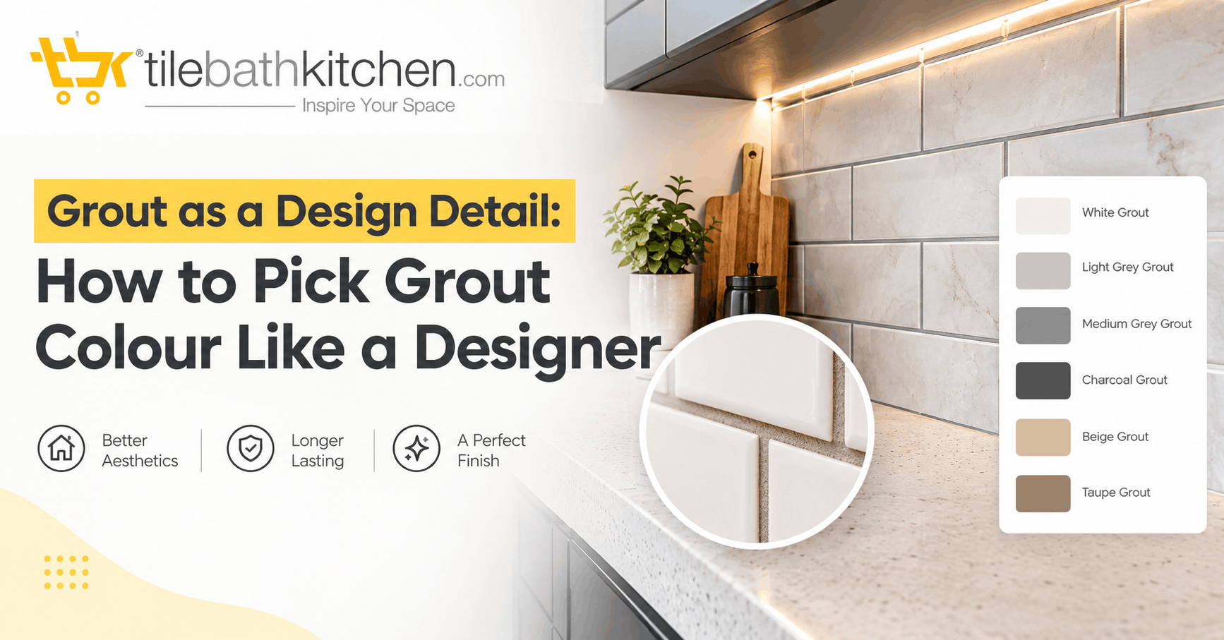
Most people spend weeks choosing tiles and about two minutes choosing grout. Usually the contractor asks “white or grey?” on fitting day and that’s the end of it. Yet grout covers a surprising share of any tiled surface, and it changes how the finished wall or floor looks more than most homeowners expect.
Designers now treat grout as part of the design rather than filler. The same tile can look calm and seamless or bold and graphic depending only on the grout around it. Here’s how to make that choice on purpose.
Why Grout Colour Matters More Than You Think
Grout lines create a grid across the whole surface. With small tiles like mosaics, subway tiles or hexagons, there are many grout lines, so grout colour can decide the overall look. With large-format tiles there are fewer joints, but every joint is more visible against a big plain surface.
Grout also ages differently from tile. Tiles stay the same colour for years. Cement grout absorbs water, soap and oil, and it slowly darkens or yellows. A colour that looks crisp on day one may look tired after two monsoons. Good grout choices plan for that.
The Three Basic Approaches
1. Matching grout (the seamless look) Pick grout that is the same tone as the tile. The joints almost disappear and the surface reads as one continuous plane. This suits marble-look and stone-look tiles, large-format floors, and small bathrooms where you want the space to feel larger and quieter.
2. Contrast grout (the graphic look) Pick grout that is clearly lighter or darker than the tile. This outlines every tile and puts the pattern on show. White subway tiles with charcoal grout, dark green tiles with light grout, and herringbone layouts with contrast joints are all examples. Use this when the layout itself is the feature you want people to notice.
3. Tonal grout (the in-between) Pick a grout one or two shades away from the tile, such as warm beige grout with cream tiles or soft grey grout with white tiles. The pattern shows gently without shouting. It’s the safest choice if you’re unsure, and it handles everyday dirt better than an exact match.
Choosing Grout by Room
Bathroom floors: Avoid pure white. Bathroom floors get constant water, soap residue and foot traffic, so white grout shows dirt within weeks. Mid-grey, greige or a shade close to your tile hides wear much better.
Shower walls: Water and soap scum build up here. A tonal or mid-tone grout keeps the walls looking clean between scrubs. If you want contrast on a feature wall, put it on the wall outside the direct spray zone.
Kitchen backsplash: Oil splashes and turmeric stains are the real test in Indian kitchens. Light grout behind the hob will discolour quickly. Choose a darker or warm-toned grout near the cooking area, or use an epoxy grout that resists stains.
Living and dining floors: These areas are drier, so you have more freedom. Matching grout on large vitrified tiles gives the clean, polished look most homeowners want in a hall.
Cement Grout vs Epoxy Grout
Colour is only half the decision. The type of grout decides how long that colour lasts.
Cement grout is cheaper and easy to work with, but it’s porous. It absorbs moisture and stains unless it’s sealed, and it needs resealing over time.
Epoxy grout costs more and needs a skilled applicator, but it’s non-porous. It resists stains, water, and mould far better, and its colour stays consistent for years. For bathrooms, kitchen backsplashes and any wet area, epoxy is usually worth the extra cost.
Epoxy grouts also come in wider colour ranges, including metallic and glitter finishes for accent walls, if you want to push grout further as a design element.
Practical Tips Before You Decide
- Test it first. Ask your tile dealer for a grout sample, then hold it against your actual tile in your actual light. Showroom lighting is very different from a bathroom with one small window.
- Look at it wet. Grout looks darker when wet and dries lighter. Judge the colour once it is fully dry.
- Think about joint width. Wider joints make the grout colour more noticeable. With 2–3 mm joints, colour matters less; with 5 mm or wider, it becomes a major part of the look.
- Match across connected spaces. If the kitchen floor flows into the dining area, keep the grout colour consistent so the transition looks deliberate.
- Plan for cleaning. Be honest about how often the space will be scrubbed. A grout that looks perfect but needs weekly bleaching isn’t the right grout for a busy family home.
The Bottom Line
Grout is one of the cheapest parts of a tiling job, and it’s one of the easiest ways to make tiles look designed rather than just installed. Decide early whether you want the joints to disappear, stand out, or sit somewhere in between. Then choose a grout type that can keep that colour looking right for years.
Next time the contractor asks “white or grey?”, you’ll have a better answer.